Data, Visualization, and the Humanities
Very often in this business, you run across ideas you had never before considered. “Data and the Humanities?” you might ask, incredulous. What on Earth does that mean?
A recent article on newsecuritybeat.org gives a great example of how data is intersecting with the disciplines traditionally referred to as the humanities — in this case, journalism. Now, journalism has always had a strong visual component (photojournalism) and every news magazine in the history of the United States has usually had at least one picture per issue. Life Magazine billed itself as the quintessential American news magazine, and it was bursting with photography from end-to-end.
The reason for this is simple: that old axiom about pictures being worth 1,000 words is very often proven true, provided you have the right picture. And in the case of journalism, a picture can really ram home your message in a way that all the writing in the world may not be able to do. You can talk about suffering in a country stricken with poverty, but a picture of that poverty can be much more compelling.
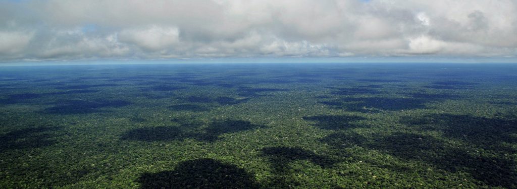
Sometimes, though, the issues being tackled in journalism resist the easy, push-button approach of a photo. What happens when you want to convey an idea that is too big for pictures; for example, something like deforestation? This is where data and visualization become essential. From the above link:
InfoAmazonia is an interactive mapping platform that hosts richly designed maps about environmental issues in the Amazon basin, serving as a growing center for discussion about the status of the world’s largest rainforest. Maps made on the site can be used as open repositories for current data from a wide-range of stakeholders and can be embedded on partners’ websites and social media. Since launch, it’s grown to become a trusted source for up-to-date visualizations and data focused on the nine countries of the region.
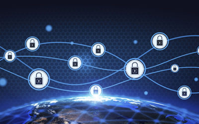
These maps, of course, are data visualizations made possible by sophisticated technology running the background — namely, data applications that collect this information, then make it available for display.

The impact of visualization on the story is undeniably huge, and this is a something you can test for yourself. Go read a few articles about the disappearance of the Amazon, and then go to the InfoAmazonia website and take a look around. I’m not saying one source is better than the other, but the benefits of visualization should be readily apparent.
It is hard to overstate the effect this kind of approach has on people. Speaking personally, looking at a map of the current state of the Amazon profoundly changes the way I view the problem. And that is the point, I think. The reason why visualization is so hot in business intelligence is because we are visual creatures. Visualization allows users to get a picture of an abstraction, or to turn a mountain of data into a reference we can all understand. If we divorce the Big Data movement from business for a minute, it is easy to imagine the huge impact this kind of visualization can have for the most important issues we have to worry about.
Has data or visualization ever changed your view of a social problem? If so, how?