Visualized Vision
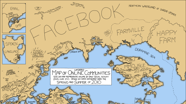
This is a really cool Gizmodo post, because it demonstrates how visualization changes your perception of things. The idea of “visualizing” the internet is interesting, if for no other reason than I am old enough to remember when “The Internet” was a thing that still needed explaining. I remember my dad — bless his heart — asking “where” the internet “was.” I was in no shape to answer him back then, and I would probably botch the job now, but the point is the question is easily answered with a few seconds of googling. And you’ll notice that the various explanations all require some kind of visualization.
Of course, the post linked above also uses visualization to make its point, which ties into the reason I brought it up in the first place. Visualization is a basic key to understanding complex facts about the world of technology, whether you are using data, doing analytics, or simply trying to learn how the internet works. Mapping the usage of the internet, or determining which apps/platforms use the most traffic through visualization, can hammer home the larger concepts that may escape us.
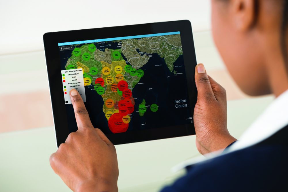
iVEDiX understands this. Take a look at these two screenshots from miVEDiX to see what we mean. Here is a table, and then a scatter plot:

Now the table above is perfectly acceptable. Really! Nothing wrong with that table. But the scatter plot above has visualized the same information — actually, more information! — in an easier to read format that ticks all the right intuitive visual cues about the data’s relationship to other variables. Again, nothing wrong with the table . . . but if you are trying to get to the bottom of a trend — and “trends” are basically big picture narratives — then you can’t go wrong with a great visualization.
We talk a lot about visualization, both here in and in our marketing collateral. iVEDiX does this because we believe that visualization is a key piece to understanding, and understanding is what gives analytics its value. For this reason, miVEDiX is a highly visual tool that puts a great premium on usable, intuitive assets.
It is very easy to go on and on about visualization because it seems to be everywhere. But as the above linked post shows, a really great visual can be a huge help in understanding a complex concept. And that’s the whole point, right?
Can you think of any data or concepts that visualizations have helped improve?