Designing With Purpose – Principles for UI and UX
 One of iVEDiX’s awesome user interface designers, Ryan Bell has helped us develop our innovative miVEDiX analytics platform. With nearly 10 years of experience in the computer software industry, and an active participant in Professionals to the World, Ryan has developed a strong grasp of what propels tech companies forward. A critical resource for iVEDiX, Ryan consults on some of today’s biggest obstacles in IT and creates solutions that make challenges like Analytics, Big Data, Cloud, Visualization, and more accessible to miVEDiX users. Continue reading to find out more about Ryan’s design philosophies, and our approach to developing an innovative user experience.
We are often asked what our philosophy of user interface (UI) and user experience (UX) design is for miVEDiX. While there’s a subjective element to design, we believe that the three core pillars of a good user experience — usability, usefulness and desirability — can be achieved by following a few key guiding principles:
- Inclusive and iterative process: before creating a single design concept, we need to have a mindset and process that empathizes with our users and values their input. We must also seek feedback to help us refine and reconsider what’s already been created.
- Respect the content: user data is the most important thing — it must be clearly and accurately presented, and the rest of the interface should defer to it.
- Efficiency: we want to let users get to the core functionality and information they care about with the smallest possible number of interactions possible.
- Inviting appearance: our interfaces should be clean and simple, including using appropriate, readable typography, but should also not lack delightful aesthetics, since attractive things work better.
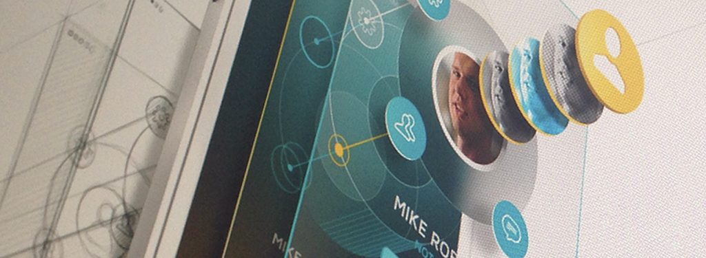
- Information hierarchy: some elements are more primary than others, and this relationship can be made clear by use of size, texture, contrast, position, and negative space, rather than just throwing hard boxes or lines everywhere to separate things. Dimensionality and layering is not gratuitous but used to support this goal.
- Clarity, consistency, and forgiveness: the meaning and function of UI elements should be readily apparent or learnable, as well as consistent across the app and mindful of platform conventions. Gestures need to be uniform and intuitive; for example, evoking tangible experiences like spinning a disc. A good UI prevents error conditions where possible, and lets users easily back out when they make mistakes.
- An interface that grows with you: advanced options should not clutter the default UI, but need to be easily activated via progressive disclosure, layering, accelerators and/or user preferences.
Of course, many of these principles are of the “easier said than done” sort, and when two or more appear to be in tension, the answer may often be less than obvious. Even — or perhaps especially — in these cases, though, they form a framework and inspiration for creative, above-and-beyond solutions.
The user experience of miVEDiX is always evolving; come check out what we’ve been up to and let us know how we’re doing in the comments!


